Analitica
A modular platform for internal workforce data
Key contributions — UI/UX Design
Overview
A fast-growing FinTech company relied on a subscription-based CMS to centralize and monitor its business data. While the platform offered powerful, data-driven dashboards fed by multiple cloud databases, it came at a high monthly. Over time, the company began searching for a more flexible and cost-effective alternative.
Goals
Design a customizable digital platform that provides relevant information for the Human Resources and Bussiness Unit departments.
Redefine roles for editors and administrators within the company, so they can work together and not depend on external contractors.
Create a component-based design that allows to scale fast and make design and development consistent.
The problem
During discovery, we aligned with stakeholders on goals, constraints, and key hypotheses to validate. This revealed critical issues with the platform, including ongoing usability complaints, unmet enhancement expectations, and declining performance. Extensive database integrations caused long load times and made information retrieval slow and inefficient.

Illustrated example of Previous dashboards
Research
User interviews helped us understand the users’ context and how they perceived the tool—as a large, data-heavy library. Insights from Human Resources and Business Unit teams revealed growing frustration with slow response times caused by extensive database connections, along with an outdated look and feel that reduced trust in the platform.

Problem framing
After gathering all possible data, we started to organize it and choose what problems could be solved framing them as How might we statements. One HMW was the main focus for later ideation.


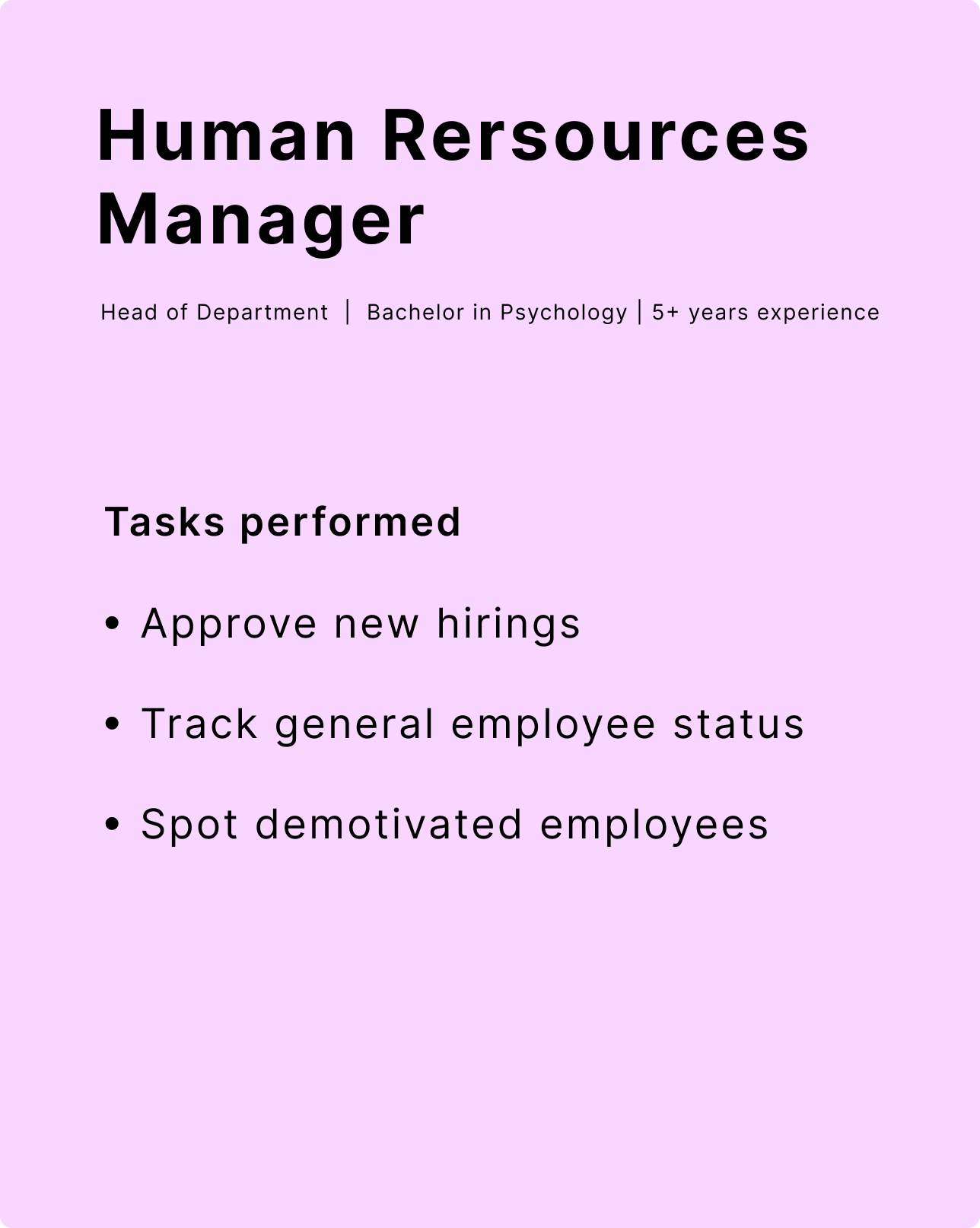
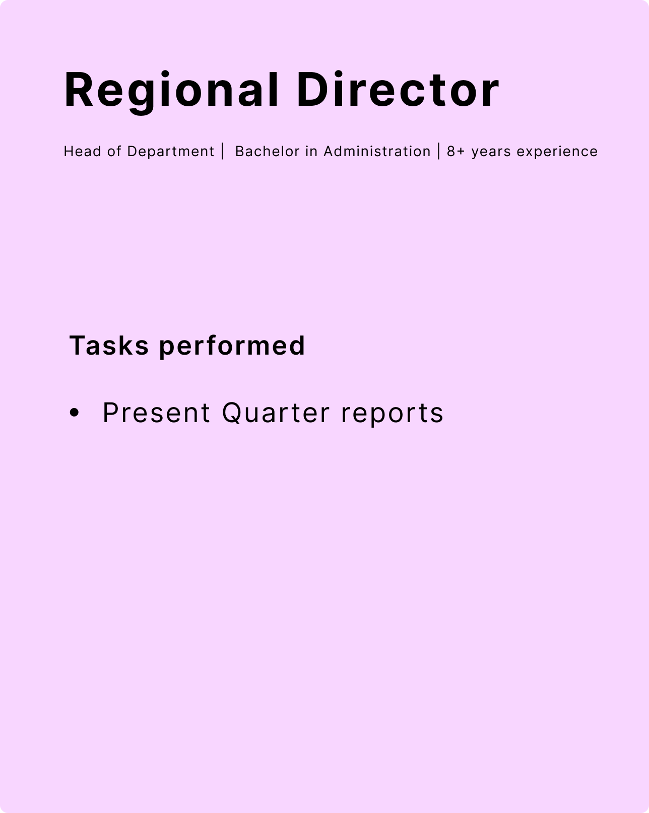
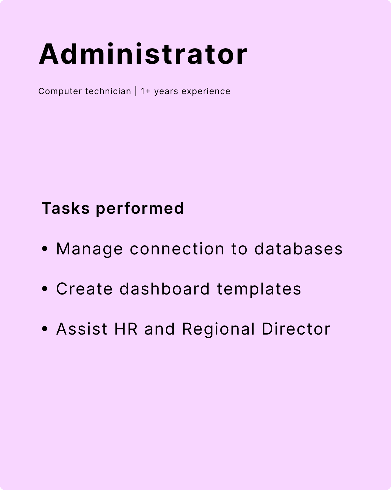
User profiles
Three user profiles were defined based on their tasks, which allowed us to focus on the main objectives they were trying to complete.
Information architecture
To structure information and define the hierarchy of different sections, we used a sitemap and wireframes for team alignment. After an initial round of lo-fi wireframes, we progressed to mid-fi versions, refining content and confirming the direction. Regular users could create, customize, and export reports, while Root Administrators were able to create tiles to populate dashboards.

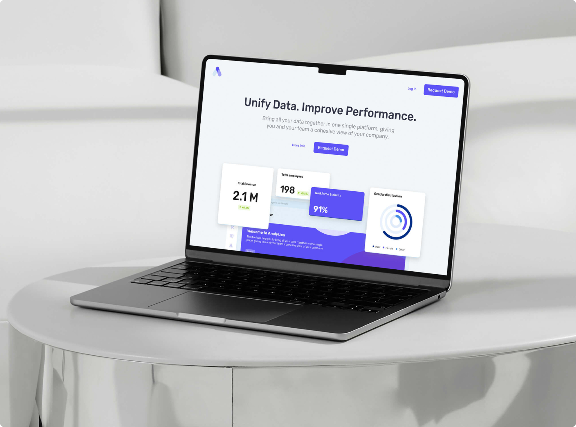
The solution
A management visualization tool for tracking company key performance indicators, designed to support custom dashboards built from a flexible set of widgets. The primary focus was a clean, intuitive interface that presents information clearly, using contrast and generous white space to guide users’ attention and improve readability.

Dashboard sections
Six main sections were defined based on useful indicators for the Human Resources and Bussines Unit, each one shows KPI´s of interest that allows this departments to make decisions based on updated information.


Tile customization
Tiles can be reordered in different layouts by drag and dropping them, allowing users to set custom arrangements for each dashboard. In addition, all the available options for the customization of a tile are displayed in the edit dropdown, such as chart style, tile name, appearance, and size.

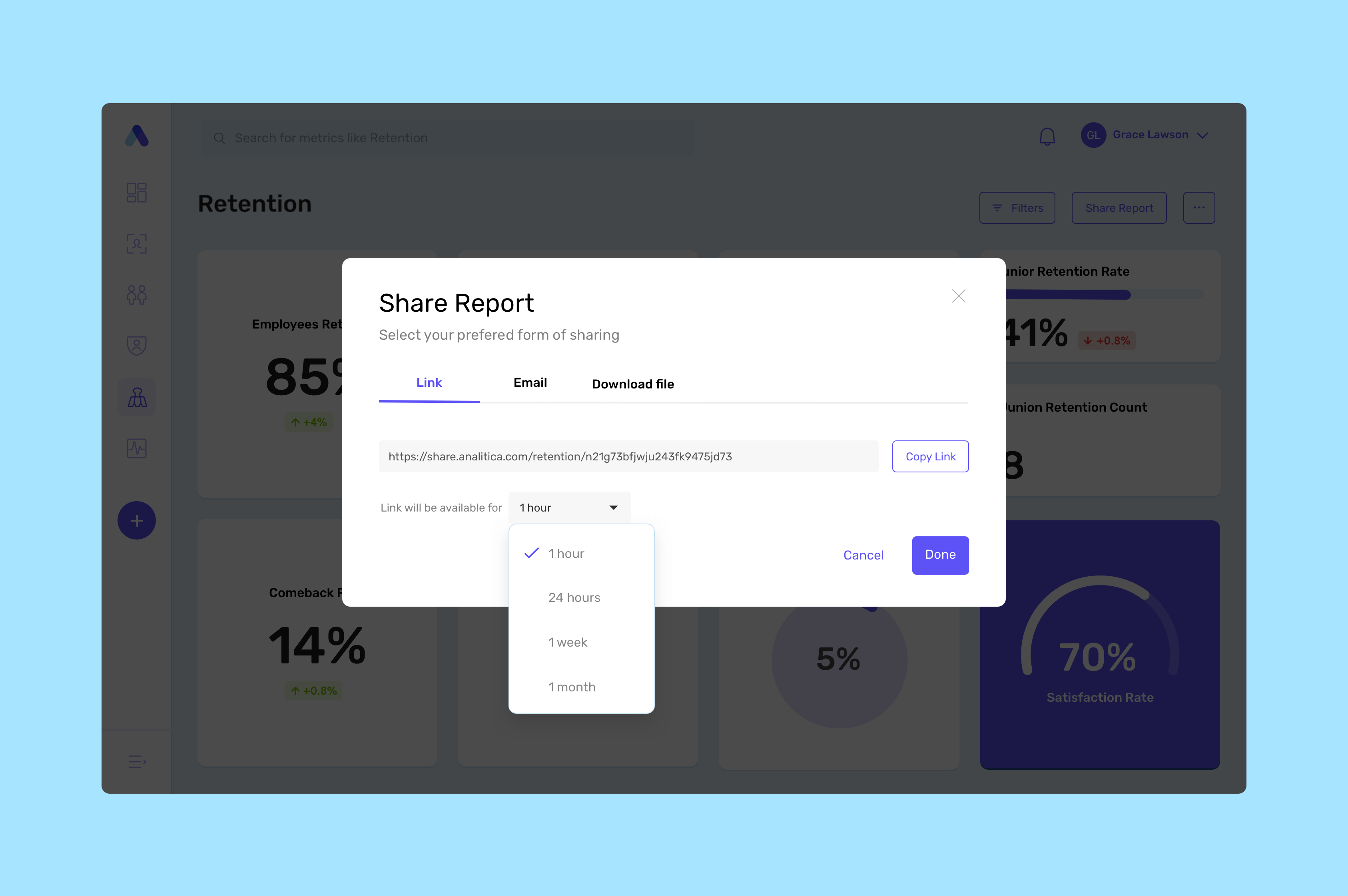
Share reports
Dashboards have several sharing options, via a link, email, or can be downloaded in PDF and be distributed in other ways.
Dashboard creation
Create a new dashboard with tiles, from a pre-existing template or from scratch. Tiles can be dragged from the tiles catalog and drop it on an open spot on the dashboard grid.


Tiles library
The nature of the project required a scalable data system that could be used as a framework. We achieved that by making a library of widgets made of pre-built data visualizations called Tiles.


Design system
A design system was created to provide centralized and consistent standards of visual language.


Web tool for Admins
The Administrator would be in charge of the supervision of the tiles that were going to be used as templates. Data was gathered from a list of connections also accessible for this role.


Feel free to get in touch
hello@mpaulinoz.com