FACEIT
Making Premium the obvious choice
Key contributions — Research, UI/UX Design
Overview
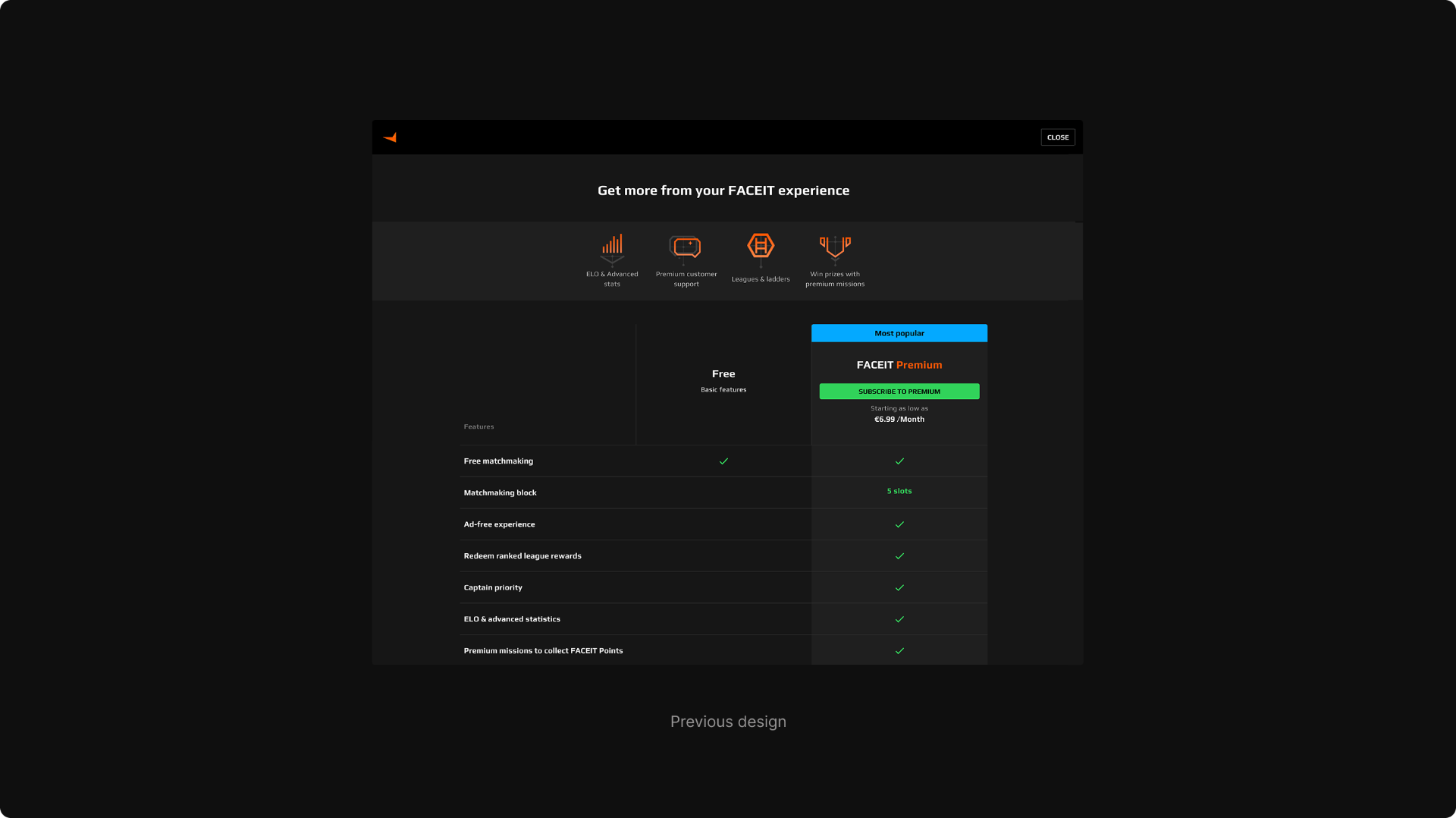
Over the years, players chose the Plus subscription over Premium, mainly due to unclear value differentiation. As part of the Subscriptions team, we focused on understanding why users made this decision. This redesign aimed to better communicate the value of Premium and position it as the more compelling choice.
The problem
Despite positioning Premium as the main option, users consistently chose the lower-tier plan. We set out to understand how users perceived the subscriptions page, how they behaved within it, and what drove their decision-making.eeds.
Approach
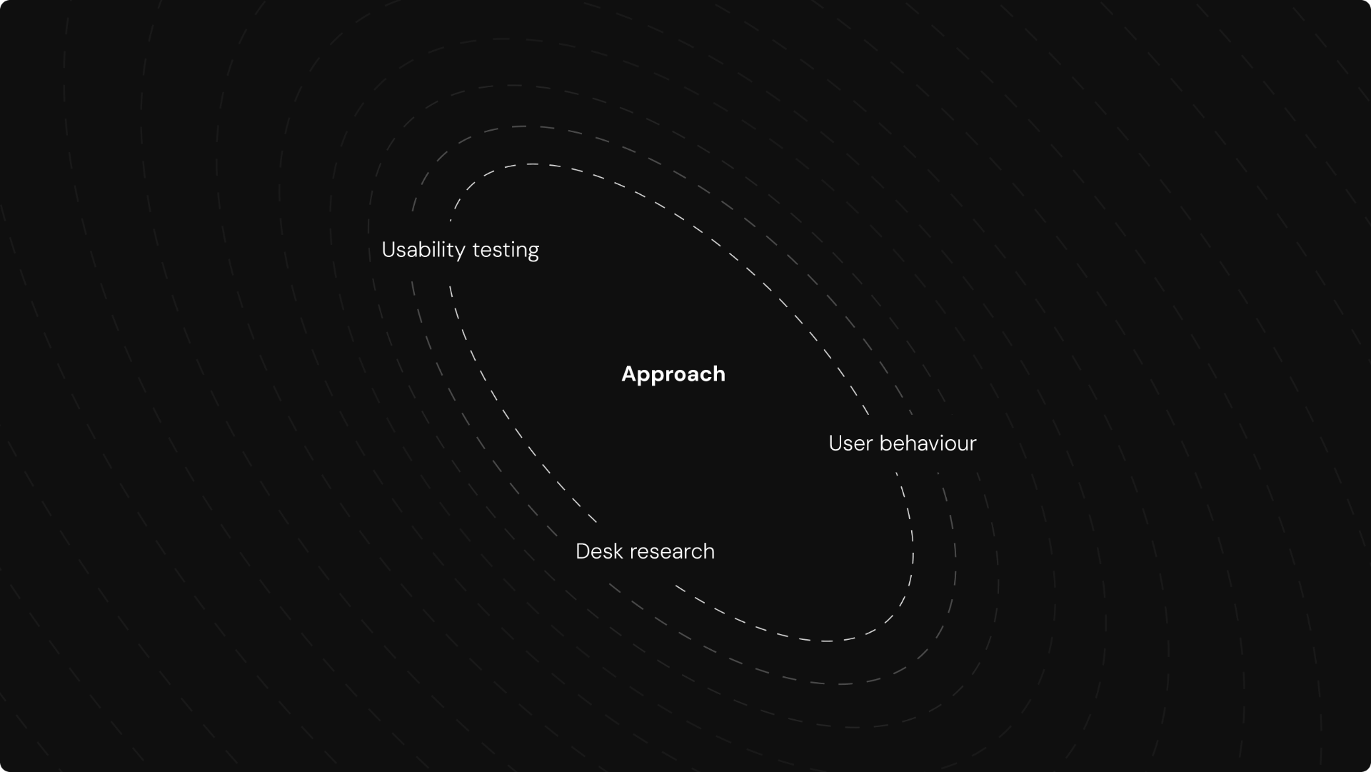
Our approach combined qualitative and quantitative insights to guide the redesign. We analyzed user behavior through screen recordings, conducted usability testing on previous subscription pages, and gathered additional context from desk research. These findings informed decisions on how to better communicate Premium value and improve the overall upgrade experience.
Research
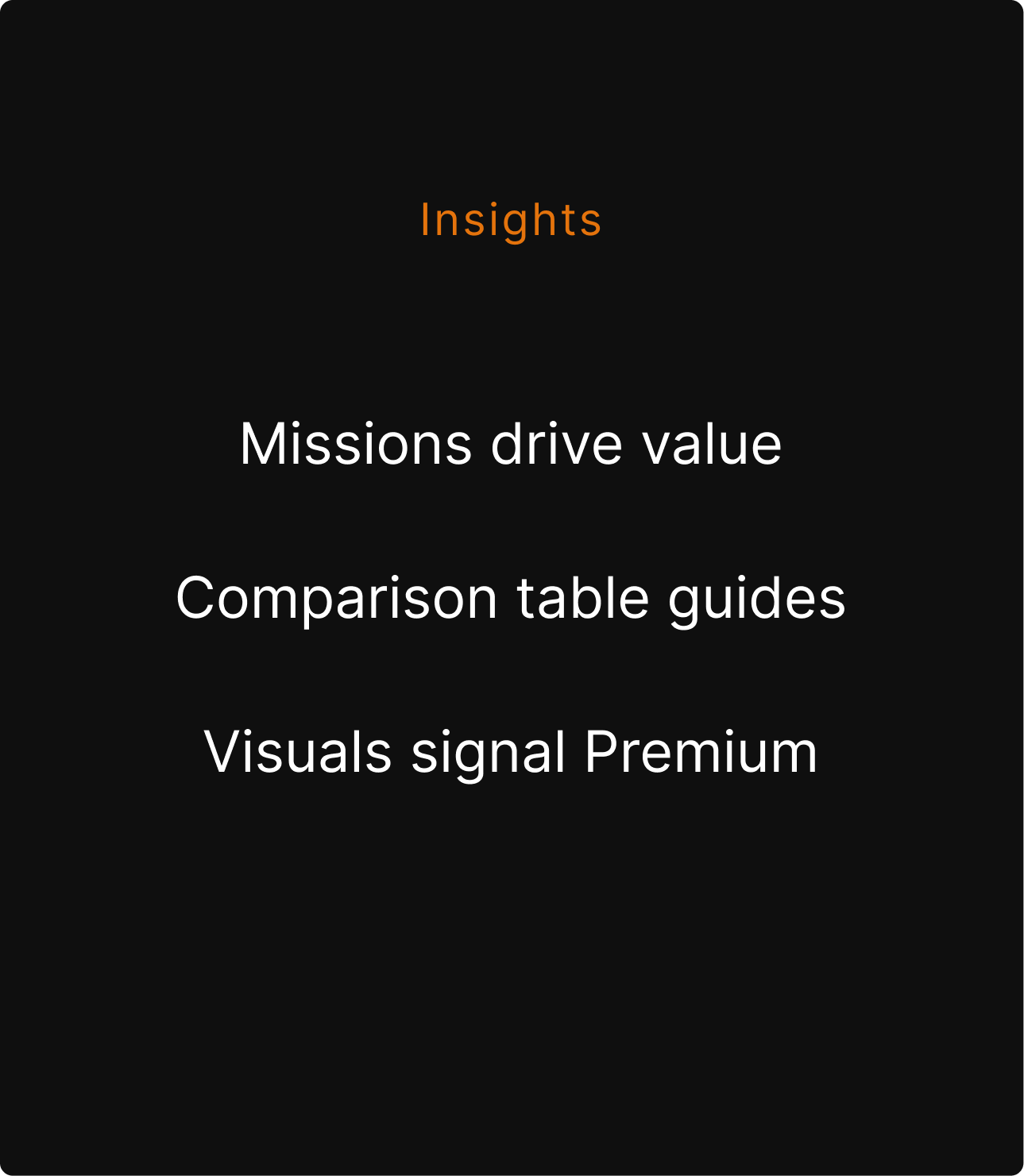
Research revealed that missions and rewards were the strongest value drivers, while the comparison table served as the primary source for learning about the subscription plans. High-quality visuals also influenced perception, positioning Premium as the more appealing option.

Main objectives
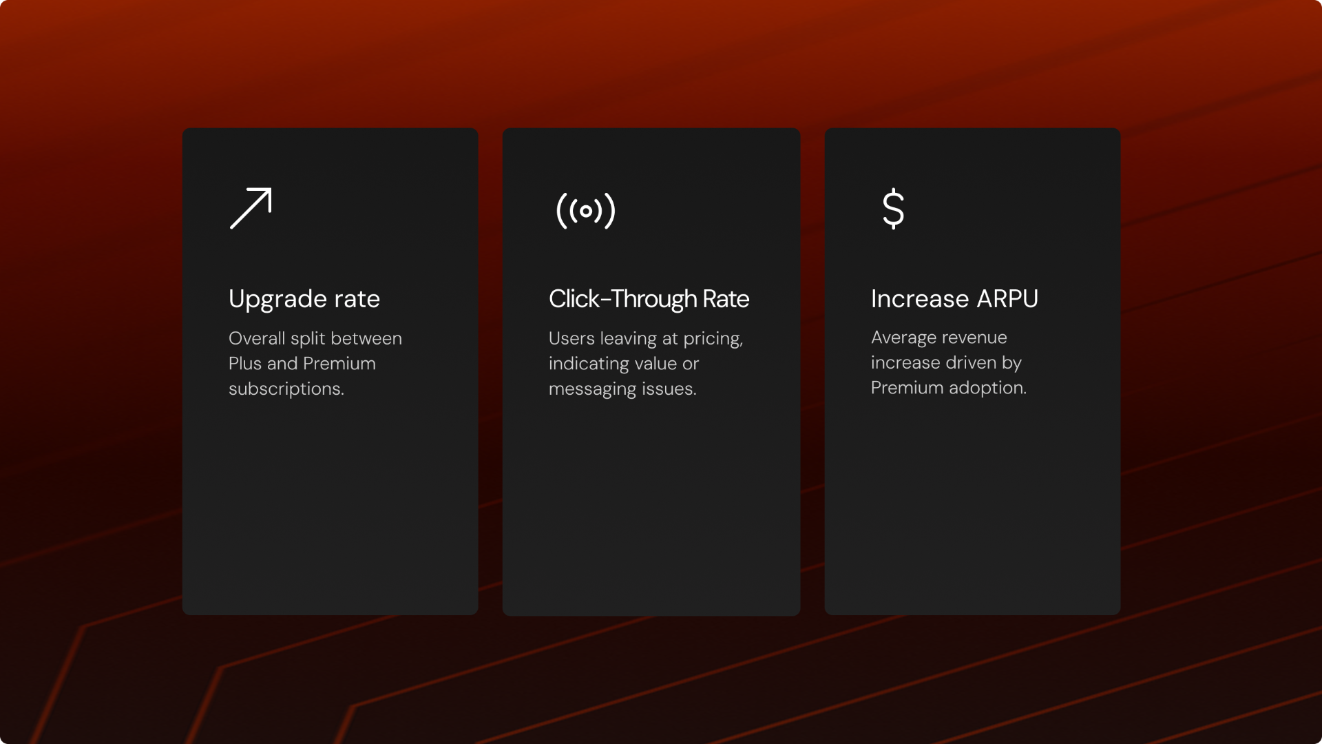
We defined the main objectives of this initiative based on key company KPIs and framed the work as a controlled experiment. This approach allowed us to validate assumptions, measure impact on core subscription metrics, and use the learnings as a foundation for further iterations aimed at continuously improving performance.s.
Subcriptions page
We revamped the subscriptions page with a clear focus on communicating the benefits of the Premium subscription, informed by what users actively looked for and how they behaved on the page. The redesign improved information hierarchy, overall UX clarity, and visual quality across the experience to better support decision-making.user needs.
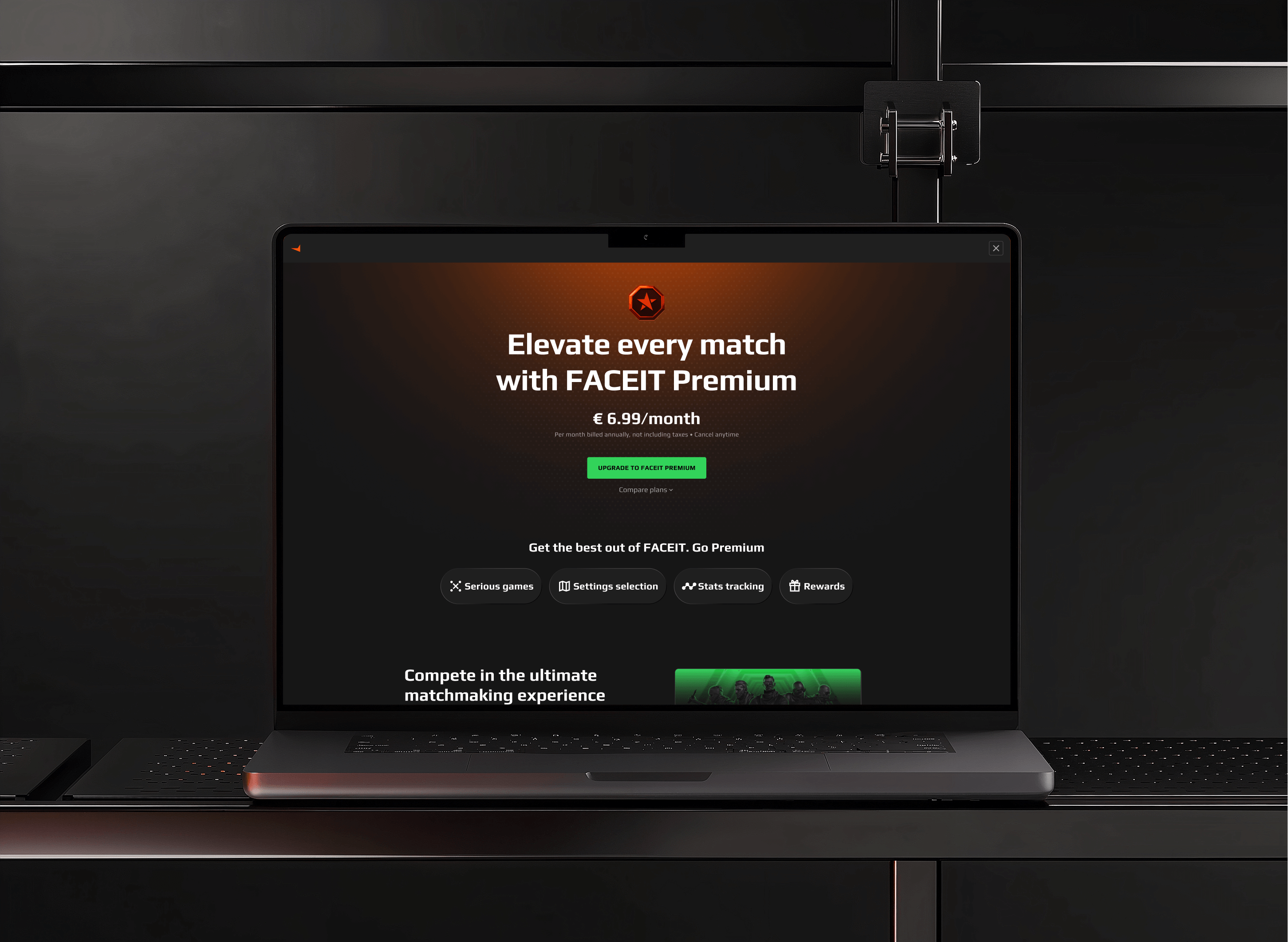
Animations captures attention
To understand the habits, motivations, and frustrations of young people interested in the stock market, I developed a research plan that included 1-on-1 remote interviews. These sessions explored investment behaviors and decision-making, with key insights synthesized into an affinity map to uncover patterns and user needs.
Visuals elevate Premium
We enhanced visuals for the gaming audience, using 3D illustrations to highlight Premium as a high-quality subscription.
3D design by Jack Smart & Will de Val



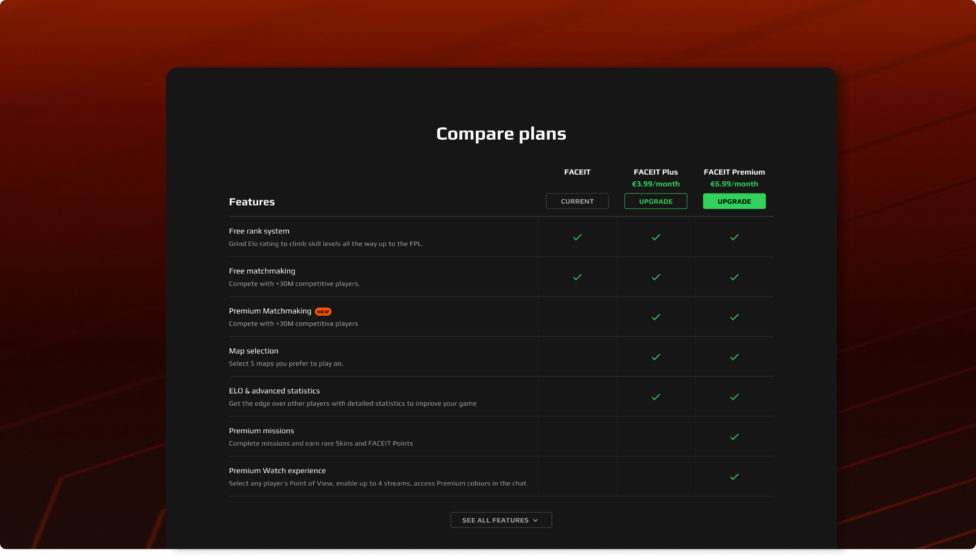
Comparison table guides
The comparison table is the key resource for users to explore subscription benefits. To support this behavior, we improved its legibility and clarity, making it easier for users to quickly understand the benefits of each plan and make informed decisions.eeds.
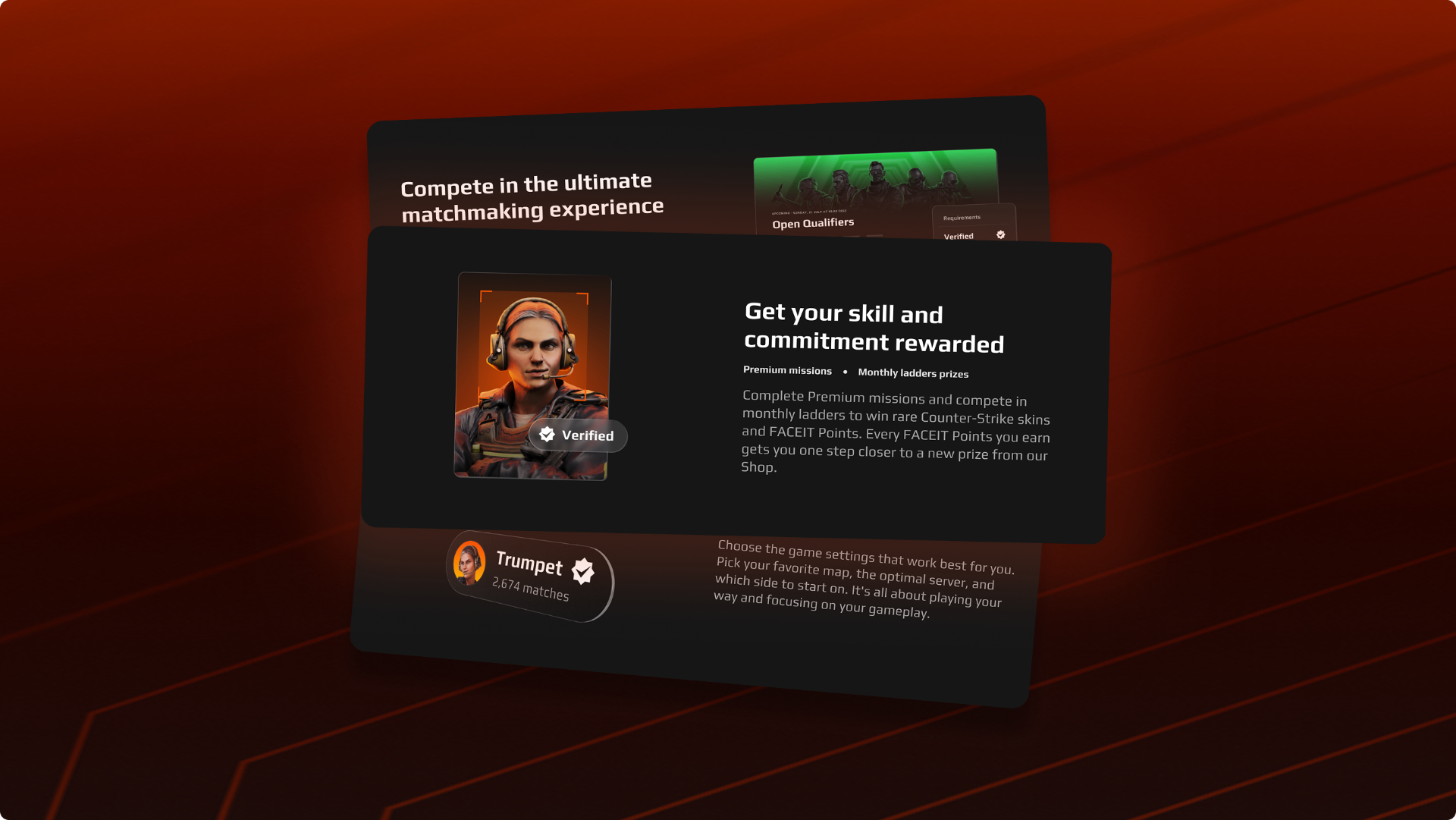
Core benefit buckets
We grouped related benefits into core proposition buckets, organizing multiple features under clear categories. This structure made it easier for users to understand the value of each area and helped them learn more effectively about the Premium subscription.
Results
The experiment was successful, meeting all objectives and improving key subscription metrics. The redesigned page enhanced user understanding, boosted Premium adoption, and provides a strong foundation for future iterations.
82%
Upgrade rate
Users were motivated to upgrade as Premium became the more attractive choice.
+23%
Click-Through Rate
Users were motivated to upgrade as Premium became the more attractive choice.
+12%
ARPU
Average revenue per user grew 12%, driven by higher Premium adoption and improved user understanding.
Feel free to get in touch
hello@mpaulinoz.com